
AllTrails Home Mobile Design 2018
Summary
Devices: Mobile
My Role: Product Designer
Project Duration: 3 months
The Business
By 2018, AllTrails had grown to over 9 million registered users, but its success created new challenges. The mobile home screen had become cluttered and impersonal, making trail discovery frustrating. Users were forced to scroll through generic lists or repeatedly apply filters, creating friction right at the start of their journey.
My Responsibilities
Research: Uncovered key navigation and usability pain points
Collaboration: Partnered closely with product managers, engineers, and researchers
Design: Reimagined navigation, filtering, and personalized recommendations
Results & Impact
User Growth
User engagement increased by 75% year-over-year.

User Retention
38% improvement, significantly reducing churn

Engagement
AllTrails experienced significant user growth, expanding from 55,000 trails in 2018 to over 300,000 trails globally by 2021

My Role & Team
I was the primary interaction designer, sketching and prototyping new layouts and features.
I coordinated closely with two product managers (one focused on user growth, another on subscriptions) to align the redesign with business goals.
I collaborated daily with engineers to understand technical constraints (like ensuring new features wouldn’t slow down the app) and to implement the designs.
Understanding User Frustrations
In summary, the problem was clear: the app’s most important page wasn’t doing its job. It wasn’t effectively connecting users to the content they wanted quickly, which jeopardized user satisfaction and AllTrails’ future growth. Addressing this was essential to maintain momentum and meet both user needs and business objectives.
Research Showed
Navigation Difficulty
Limited Customization
lacking Homescreen content

User Painpoints
(Key user pain points identified)
Daniël
"The app forces me to scroll through too much content before I can just get to my saved lists or recently viewed trails. The homepage should be more customizable."
Mani
"There’s no easy way to browse by trail type—why can’t I just see ‘best loop trails’ or ‘waterfall hikes’ without digging through a bunch of filters?"
Lauren
"The discovery section prioritizes popular trails, but I wish there was a better way to surface hidden gems instead of seeing the same hikes over and over."
Rita
"Frustrating—filters are limited"
Davo
"Why does the homepage keep pushing trails that are hours away? I want to explore what’s near me, not be bombarded with suggestions I’ll never drive to."
Parker
"Discovery doesn’t feel personalized at all. I hike mostly in forests, but I keep getting recommendations for desert and coastal trails I’d never consider."
Manoj
"The discovery section prioritizes popular trails, but I wish there was a better way to surface hidden gems instead of seeing the same hikes over and over."
Fekry
"The homepage keeps showing me trails I’ve already completed. There should be an option to hide or deprioritize trails I’ve marked as 'done' so I can discover new ones."
Miguel
"There should be more niche categories like ‘Historic Trails,’ ‘Best for Wildflowers,’ or ‘Most Photogenic Hikes.’ Right now, the discovery section feels pretty generic."
Our Design Journey
Research
We started by analyzing user behavior patterns and conducting interviews to understand exactly how hikers, runners and cyclists were using the app.
1-2-3 Iterations
Our first concept organized content into distinct sections within a scrollable feed—already an improvement, but testers found it still felt too generic and lacked personality.
Visuals & Testing
Aligned out styles post wireframe interactions with new features.
Original Design
Navigation Difficulty: Users struggled to quickly access saved or previously viewed trails.
Limited Customization: Users wanted enhanced filtering and personalization to find suitable trails faster.
Inefficient Layout: Excessive scrolling diminished user experience, discouraging prolonged engagement.

Iteration 01
Our first concept organized content into distinct sections within a scrollable feed—already an improvement, but testers found it still felt too generic and lacked personality.

Iteration 02
We added personalized touches like greeting users by name and surfacing their recent activity: "How was Twin Peaks Trail? Leave a review!" We also introduced category cards that proved surprisingly inspiring—users loved discovering new trail types they hadn't considered before.

Iteration 03
The final iteration refined visuals and messaging, adding warm welcome imagery and clearer filter designs. This version tested exceptionally well and moved forward to launch.

Solution & Impact

Categorized Navigation
We created clearly defined sections for different activities (Hiking, Running, Cycling) to simplify navigation and content discovery.
Enhanced Filtering
Advanced filtering options let users quickly narrow trails by distance, difficulty, and personal preferences without repeatedly configuring settings.

Personalized Suggestions
Our algorithm-driven suggestions now adapt to individual behavior and history, with transparent explanations like "Based on your recent hikes" to build trust.
Design Summary
Each solution included thoughtful UI elements that made the experience feel both intuitive and personal. Small touches like explaining why certain trails were being recommended made the app feel intelligent and user-centered rather than random.
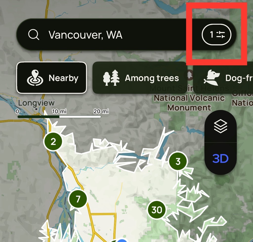
Final Designs
Assists users in locating nearby trails and provides guidance throughout their journey.

Style Guide

Solution & Impact
75% increase in overall user engagement year-over-year.
38% improvement in user retention, demonstrating
Post Release Quotes
Rita
“The new design is clean and intuitive. It’s much easier to find trails that match exactly what I'm looking for.”
How did the Designs hold up?
A few years later, the AllTrails mobile app won Apple's "iPhone App of the Year" award—a testament to the foundation we built with this redesign.

Personal Reflection
This project reinforced the power of user-centered design and cross-functional collaboration. By directly aligning our solutions with both user needs and business objectives, we created measurable impact across all key metrics.
The experience deepened my strategic design thinking and leadership skills while reinforcing my commitment to creating experiences that truly serve users' needs.
Thank you for reading!

Ian J Busik
View more Case Studies Below


Oculus
Dive into the world of VR and the innovative research and design that went into crafting the landscape we have today.
Enter VR →