Revolutionizing First-Time Virtual Reality Experiences
(2015–2019)

Project Summary
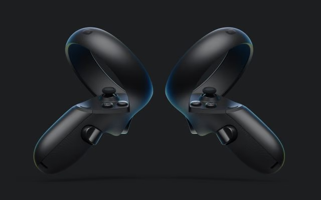
Role: UX Designer for Oculus Rift & Oculus Link
Project: Oculus Rift & Oculus Link
Focus: UI design, onboarding experiences, and user research
My Work
When VR was still finding its footing, newcomers faced daunting setup processes and safety concerns. We set out to make that crucial first experience with Oculus both accessible and delightful, focusing on simplified onboarding and intuitive safety features that let users dive into virtual worlds with confidence.
The Early Challenges
Business Details
Early VR faced a tough reality: complex setup, steep learning curves, and safety concerns kept potential users away. Our mission? Transform that first-time experience into something anyone could enjoy with confidence.
Key Results

Faster Onboarding
Cut setup time from 20 to 14 minutes
Mainstream Success
250K headsets sold after release

Safer Experiences
Reduced boundary collisions by ~50%
The Beginning 01
Widespread Adoption Concerns
Early Oculus users often felt overwhelmed by complicated setup instructions and unfamiliar interactions. Many worried about bumping into walls or furniture while immersed in VR. Our mission became clear: make getting into VR easier and playing in VR safer for everyone.
Big Ideas & Big Problems
We identified two critical challenges
New Environments
Users easily lost awareness of their physical surroundings in virtual worlds, risking collisions with objects and walls.

User Comfort
Extended VR sessions sometimes caused eye strain, and connecting to PC content via Oculus Link needed to feel natural rather than frustrating.
Solution 01
The BrokenWall Approach
We transformed the static VR boundary into something dynamic and responsive the "BrokenWall." Instead of a simple grid, this intelligent boundary visibly cracks open toward any intrusion. When a pet wanders into your play area or you approach furniture, the wall breaks in that direction, giving you an immediate, intuitive warning without disrupting your immersion.
Contributions
Designed Oculus’s onboarding experiences and Ui.
Desinged Prototypes used for Lab conduced Usability tests.
Assisted with Research Testing (Halo, Brokenwall, Guadian System)
Solution 02
The Guardian System Evolution
We integrated BrokenWall into Oculus's Guardian safety system, elevating it from static boundary to intelligent protector. The familiar grid became responsive—breaking toward intrusions and potential hazards while maintaining your sense of presence. This evolution helped users feel safer and more confident during VR sessions.
Research & Testing
Methods of Testing
We evaluated three competing safety notification systems
BrokenWall – A dynamic wall that visibly breaks toward intrusions
Halo – A green edge indicator showing which side an intrusion was coming from
Radar – An overlay showing the position of intrusions around you in real-time
Research Metrics
Through multiple testing rounds, we measured both usability and cognitive load. BrokenWall required significantly less mental effort (scoring 5.2 vs. 6.8 for Halo and 9.0 for Radar), while our System Usability Scale score of 69.1 exceeded VR industry benchmarks. Users consistently reported BrokenWall provided the clearest, most intuitive feedback.
Cognitive Workload Results

BrokenWall
Mean score = 5.2 (SD = 2.6)
Halo
Mean score = 6.8 (SD = 2.3)
Radar
Mean score = 9.0 (SD = 2.5)
Pre research Goals

Improved Legibility
We wanted safety alerts to be instantly understandable no thinking required during gameplay.
Optimal Placement
Warnings needed to be noticeable without blocking important visuals or disrupting the experience.

Natural Interaction Patterns
Safety cues should feel like a natural extension of the VR world, not an intrusion from outside it.
Design Approach

Prototyping and testing
We built functional VR prototypes to test safety concepts in realistic scenarios, observing how users naturally responded to different approaches.

Integrated User feedback
A diverse group of testers from VR newcomers to experienced users provided insights that shaped each design iteration.
Accessibility Benefits Everyone
We discovered that designing for accessibility created a better experience for all users. Clear visuals and low-effort interactions initially conceived for newcomers and those with motion sensitivities made Oculus more enjoyable across the board. This inclusive approach became central to our design philosophy.

UI Design Process
Our UI worked with familiar canvas tools while creating a cohesive experience.


Controllers
We aligned controller designs with our safety features, optimizing navigation for both thumbsticks and directional pads so moving through menus felt natural regardless of input preference.
Reduced Learning Time
Simplified onboarding and intuitive design patterns significantly cut the time needed to become comfortable in VR.

Increased User Confidence
Clear boundaries and responsive feedback gave users the confidence to move naturally in virtual environments.
Enhanced Engagement
By reducing safety-related cognitive load, users enjoyed deeper immersion in VR content.

Preserved Immersion
Safety features blended naturally with VR environments, maintaining presence even during potential hazards.
The Learning Journey
(The Failiures)
Not every idea succeeded. An early prototype with constant radar display proved too distracting, pulling users out of their experience. These setbacks became valuable learning opportunities—through rapid iteration and user feedback, we transformed missteps into improvements. This process reinforced that patience, persistence, and active listening always lead to better solutions.
Proud Results
30% Faster Onboarding: First-time setup dropped from 20 to 14 minutes
Higher Satisfaction: ~90% of users gave positive feedback, with 80% rating the experience 4-5 stars
Feature Adoption: Over 70% of Quest owners embraced Oculus Link within three months
Safer Play: Boundary collisions dropped by approximately 50%
Results and Impact
Workload Assessment
• BrokenWall: Mean score equals 5.2 (standard deviation equals 2.6)
• Halo: Mean score equals 6.8 (standard deviation equals 2.3)
• Radar: Mean score equals 9.0 (standard deviation equals 2.5)
Usability
An overall System Usability Scale score of 69.1 placed our system above industry benchmarks. Participants especially valued the clarity of feedback and the ease of learning provided by the BrokenWall cue.
Post-Release Impact
Our data-driven approach confirmed that reimagining VR safety could meaningfully enhance the entire experience. We reduced physical collisions while lowering cognitive load so safety cues were processed almost subconsciously. Most importantly, we achieved all this while deepening overall engagement—users stayed absorbed in their experience, many forgetting the safety system existed until it needed to alert them.
Personal Reflection

The Oculus project challenged me to grow as both a designer and innovator. I'm proud that our work helped make VR more welcoming and enjoyable for everyone. The lessons gained creating intuitive onboarding, simplifying complex interactions, and championing the user through data continue to shape my approach to design. This experience reinforced my belief in UX's power to transform cutting-edge technology into experiences people truly love.